Logo Wiki alone 1.2

Mobile interface

Table of Contents

Mobile UI explanation

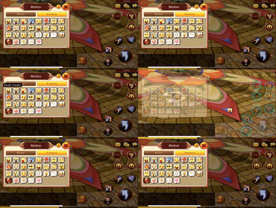
Primary menu animation on Mobile

Put an emoticon as shortcut on Mobile

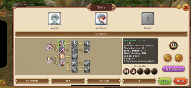
Skill Window on Mobile

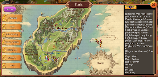
Map Window on Mobile

The layout is a bit different as the NPC Selection is a list box instead of a combo box. However the left menu remains the same.

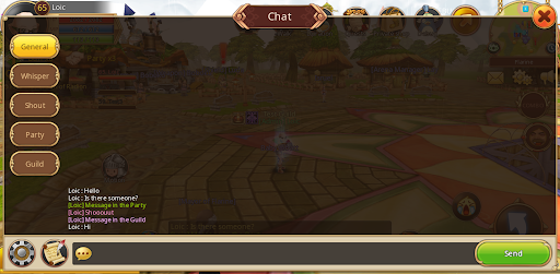
Chat Window on Mobile

The main screen will always show a preview of the chat. Touch it to open the complete chat window. The button with a cog inside is used to toggle the Chat Filter. The button with a scroll inside is used to toggle System Messages.

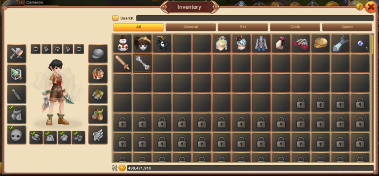
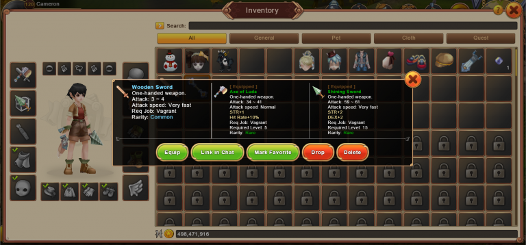
Inventory on Mobile

When the player touches an item it opens a menu with all the actions available for that item.

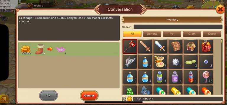
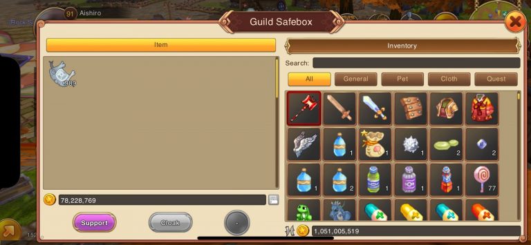
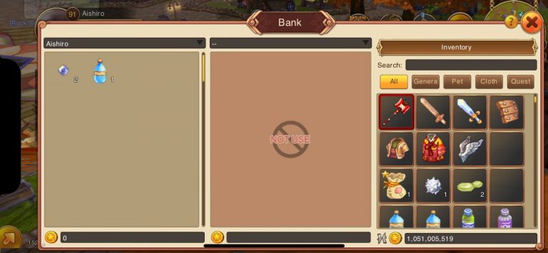
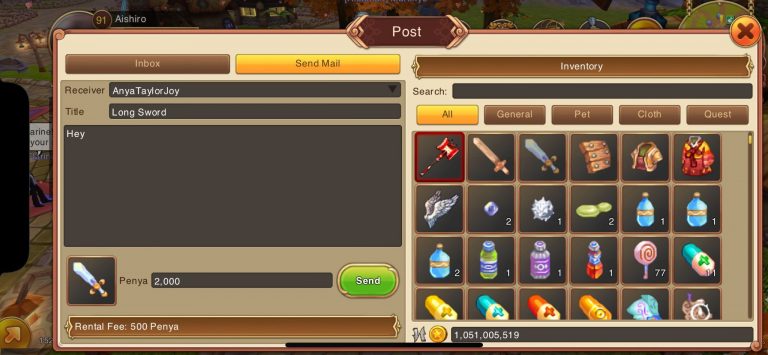
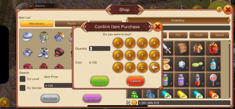
The Inventory is also embedded in all windows which require interaction with items.

Character Window on Mobile

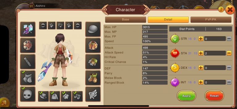
The Character window shows more information about the player parameters. All existing parameters can be viewed in this window. A parameter is not displayed if it is equal to its default value. When stats are being edited, all affected parameters can be previewed with more information than before. There is a 2 column display when the window is large enough. As in Flyff PC, there are several columns for stats: the one on the left shows the total stats (with bonuses) and the one on the right shows the base stats assigned with Stat Points.

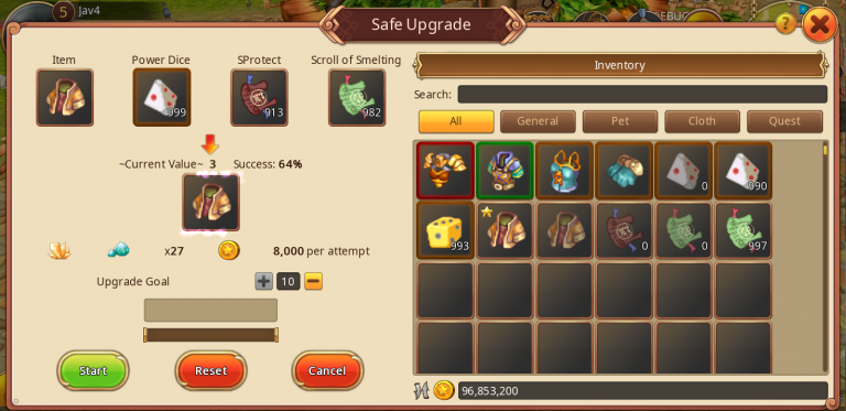
Upgrade Windows on Mobile

All upgrading windows (Piercing/General Upgrade/Card Upgrade/Element Upgrade) have been improved. They will always show a preview of the upgraded item and the probability of success. The item preview has a little sparkle effect. On mobile, the inventory displayed next to the window filters the items to display only those relative to the upgrade process.

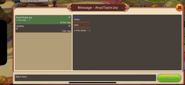
Message Management on Mobile

Tired of losing a conversation when closing a Message window? The Messenger Window will allow you to view your messages, even if you have closed them! You can always delete a conversation with the cross.

Warning: this only concerns the current game session and if you reconnect you will not find your previous conversations.


Views: 2831

Do you like my website and want to make it bigger?

Then be so kind as to recommend it to other players on Discord and in-game.

Thanks!

Yours sincerely Tacota


Dear Visitor,

Beyond the option of supporting me (Tacota) through a one-time donation or a monthly membership,
there’s yet another way you can contribute financially to my project.

At no cost to you!

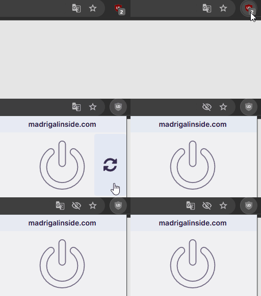
Simply by disabling your ad blocker on my website, you’d be helping me tremendously.

If you occasionally click on an ad, it would give me (Tacota) an even greater boost, as one click is worth hundreds of ad views.

Thank you so much for your support!

Dear Visitor, I (Tacota) have a crowdfunding page.

This campaign helps me dedicate more time and resources to this project, allowing it to grow and thrive.

Support Packages

For all Supporters:
✓ Get a subscriber account on madrigalinside.com for no more ads,
    no more this donation, and no more AdBlock disable reminder pop-ups.
✓ Mention in the supporters list

If you’d like to gather more information first, please click here to visit my detailed page about my crowdfunding.
(A new tab opens, this pop-up would say) 

New quality of life feature!

You can now search between the sections “Game data”, “Guides”, and “News” with clickable dropdown recommendations.

The standard setting is Game data with shown categories, Item, Monster, NPC, Quest, Achievement or Dungeon.

The 1.6.0 API data is online. Unfortunately, there are currently some difficulties in creating the detail pages for the new item pages, but you can already see the description and some models by hovering over the names.